Showing posts with label digital. Show all posts

5/10/08

poster illustration progress


click on image to view large

so my leaping guy now has some color and i am adding some shadows and highlights in the buildings. Was thinking about adding his own shadow on the buildings but I feel he's too high up in the sky for that to look 'real'.

This isn't the final color palette which gives me a bit of anxiety. I've got more than 10 colors in there already and I have no idea how I'm going to simplify it down to just 4. I just don't like simple. I like complex and detailed.

I am planning on finishing the poster tonight. I am guesstimating about 5 more hours. Don't know if that will actually happen because my eyes are exhausted. So much to do. The weekend isn't long enough.

4/11/08

NPDA poster design

I am currently working on a million things at the same time which kinda gives me ADD. The thing I'm focusing on this weekend is my illustration for the NPDA poster design.

NPDA stands for the National Portfolio Design Association and the poster is done to advertise for the event.

Here's a very quick digital concept sketch of my idea.

3/28/08

shading

I am trying to guesstimate how many hours this illustration will take.

click on the image to see detail


So here, I am continuing to create shapes and while keeping my swatches palette handy, I am choosing colors that may mimic pleats or shadows but I am staying true to the original drawing.

At this point, I usually start thinking about the background image.

3/27/08

new drawing

A couple of people have asked me how I made my book cover illustration so I will go through the steps and hopefully it will help those who are curious about achieving the same effect.

I really love the look of water color, but find it very hard to control and very easy to mess up.
I must admit I've ruined a few drawings before while working with watercolors, when I realized that a wash has flown into a another that was not yet dry.

I have an OCD when it comes to colors so I drive myself crazy with watercolor paints since the washes can be so unpredictable.

Illustrator makes it easy to create drawings in this style and I am able to change the color scheme in seconds.

It's hard to believe I didn't know Illustrator at all just a few years ago, now I couldn't live without it..

Now if only life came with a command+z button!

Anyway...

Here is the sketch in the beginning stage:
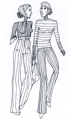
A simple line drawing done in graphite, then ink, scanned in at a high resolution and cleaned up. I make sure here to save the drawing with the extension of .png because it preserves line work better than .jpegs.

I then pull the drawing into illustrator and lock that layer. On a new layer, I use the pen tool to put down a "wash" of color over the entire image. I set the transparency to about 30-40% for that shape.
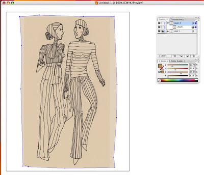
It's smart to name layers if the illustration is complicated and requires a lot of different shapes in case you want to go back and make changes.
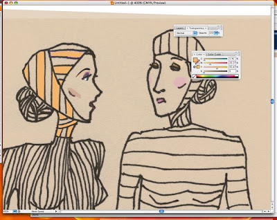
Leaving the background color as the skin tone, I locked that layer and created a new one. On the new layer, I began mapping out shapes using the pen tool, making sure not to cover up the line work. If I want the background wash to show through and also to soften the intensity of the the color, I make the shapes more transperent. (for ex., the cheeks) And if I want the colors to be more brilliant and bright, I use very little transparency or leave it at 100% (like I did for the orange).

It's also good to experiment with different colors and transparencies to see how they create color combinations in layers. With a drawing made in this style, I continue to create shapes and work out a harmony between the colors, constantly changing and tweaking until it's satisfactory.


More on this later during the week!

2/24/08

finished book illustration

Ok, finally done! I might have to adjust the colors in PSP because the printer majorly screws up the palette all the time.
I already noticed that my colors changed a little since I converted the file from .ai to .jpeg.

Frustrating.

Nevertheless, I am quite happy with how this turned out.

Stay tuned for my next illustration of one of my favorite DJs Amon Tobin. Here's a little rough sketch of it:


2/16/08

little sketch to keep my strength up

So I stayed up rlly late last night and had to wake up pretty early for work this morning so I'm in dire need of a nap. I am afraid of screwing up my sleep pattern (it's too early in the semester to be pulling all nighters still, agreed?) so I sketched in Illustrator to keep myself from dozing off. The line work was a bit tricky since I don't have a mouse, just a tiny touch pad with silly buttons. But it kept me up nevertheless.


The sketch is of actor Sam Riley. Pen tool in Illustrator. Reference photo thanks to google.